My Animation
This is a recording of my animation on how to write a Haiku. I hope you like it and maybe even find it useful for your language skills.
The Design
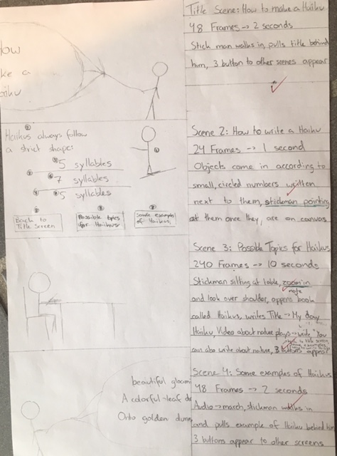
Everyone should make a design when they make a product as this helps keep in mind and imagine what the final product will look like. You will not be successful when you start a project without a clear goal of what you are making. I decided it would be nice to show how my design looks like and share what changes I made to the design.
Changes made to Design
Mostly the timing of each frame was an estimate and I was off for each scene except for the last one. My first scene lasted 10 frames longer than I had originally planned because somehow I couldn’t make the walking of the stick man look natural at such a speed.
The same thing happened with the second scene, I could not make everything appear clearly while keeping it easy to follow at such a speed. This was my mistake while planning, I should have realised that having 8 objects move around the screen, many including text that needed to be read, would not work in 1 second or 24 frames. In the end I needed almost 50 frames to complete this scene.
My 3rd scene was the complete opposite, I had planned to add in a video about nature but I ended up only using a picture with an audio file. I did this because of 2 reasons, 1 being that the video files that fit what I was searching for, were to long and I couldn’t convert them into a .flv file and the 2nd reason being that I did not have enough time to search for a fitting video and wait for the long conversion. Since I did not have a video I did not need 240 frames but only 120. I would say that especially that scene could have been prettier if I had more time as the zoom in effect is somewhat jerky and off.
Another change I made was in the last scene where the stick man wasn’t pulling the rope while facing it but pulling it while walking forward stubbornly and only turning at the end.
In scene 2 I numbered what object would come in when in the design but I actually made the stick man come in second, directly after the title and not before. I also made the two lines come in together and not one after the other because I felt that this made the animation look more structured than if everything came in separately.
Something I forgot to mention in my design was where my buttons would be on the canvas but I wanted them next to each other in a row across the bottom of the screen. I did this in almost all of the scenes as can be seen above, except for the last scene in which I did not have enough space at the bottom of the canvas. Since I did not have enough time to move everything upwards I made the buttons line up at the top instead.
What you can’t see in the picture is that I made notes on fonts and colour of items on the back of the paper. I mostly stuck to this, the only change being that I did not only use font sizes 12 and 60 but also 20, 30, 40, 50 and more. This was because some items like the book in scene 3 needed a name that became bigger as the book became larger or because the surrounding space was to small or to big for these two fonts.
Conclusion
Thank you so much for reading this blog post. I hope you enjoyed my animation and realised that the changes I made to my design are normal in any process as an idea evolves during the creation process or sometimes things just don’t work the way you imagined it. I hope that all of my blog posts were of use and I am sad to announce that I will probably stop blogging here as I need to focus on other things. Again, thank you so much.
